Artwork has the power to transform a room—adding personality, mood, style, and even perceived space. But one of the biggest challenges in interior design isn’t choosing art you love, it’s choosing art that fits the scale of your space. The right size can make artwork feel intentional, balanced, and harmonious. The wrong size can make even the most beautiful piece feel awkward or out of place.
Whether you’re decorating a living room, a hallway, a bedroom, or a dining area, understanding how to select the perfect artwork size is essential. This guide walks you through expert principles and practical tips so that every piece you hang feels like it belongs. Curated collections from MusaArtGallery offer beautifully scaled artworks that work in virtually any space.
Why Size Matters More Than You Think
Art doesn’t exist in isolationist interactions with its surroundings. Scale affects:
- Visual balance: Properly sized art feels anchored, not floating or overwhelmed.
- Furniture relationships: A piece that’s too small gets “lost” above a sofa or bed, while a piece that’s too large can overpower and make a room feel chaotic.
- Room perception: Well-scaled art can make a space feel larger, cozier, lighter, or more dramatic depending on placement and proportion.
Much of what makes art feel right is relative. A small print might be perfect in a study but tiny above a 9-foot sofa. Likewise, a huge canvas might dominate a small reading nook. The goal is harmony—where artwork complements rather than competes with the room.
Rule #1: Match Artwork Width to Furniture
A foundational rule in interior styling is to relate artwork size to the furniture it accompanies.
Over Sofas, Consoles, and Beds
When placing art above a sofa, console, or bed:
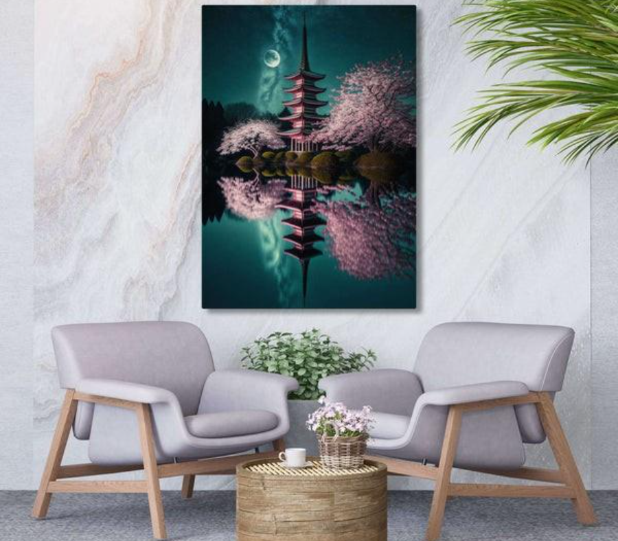
Artwork should be about 60–75% of the width of the piece below it.
- A 72-inch sofa deserves art roughly 43–54 inches wide.
- A 48-inch console looks best with art that’s 29–36 inches wide.
Why this works: Art that’s too narrow feels like it’s floating, disconnected from the furniture. Art that’s wide enough feels intentional and visually anchored.
Gallery Walls
If you’re creating a gallery wall above furniture:
- Treat the entire cluster of frames as a single unit.
- The total width of the installation should still fall within the 60–75% rule.
Larger arrangements are often read as a single visual block, so they can reach the upper end of the range without overwhelming the space.
Rule #2: Consider Ceiling Height and Wall Space
Empty wall space is about more than width—it’s also about height.
Standard Ceilings (8–9 feet)
With standard ceiling heights, consider:
- Placing art so the center is at eye level (around 57–60 inches from the floor).
- Leaving 4–7 inches between the top of furniture and the bottom of artwork.
This spacing visually connects the piece to the furniture without crushing the composition.
Tall Ceilings & Large Walls
In rooms with 10+ foot ceilings:
- Bigger artwork or multi-panel installations work beautifully.
- Taller pieces help fill vertical space and prevent your walls from feeling cavernous.
Oversized art can also make high ceilings feel cozy by drawing the eye inward.
Rule #3: Use Multiple Pieces Strategically
Sometimes the right size isn’t one piece, it’s a composition.
Parallel Pairs
Two identical or similar pieces on either side of a focal point (like a fireplace or bed) create symmetry and balance. Each piece should still follow the 60–75% rule individually, but pairing allows creative flexibility.
Gallery Walls
Gallery walls are a great way to fill large expanses of wall without one massive piece. To keep visual harmony:
- Start with a dominant central piece.
- Add supporting pieces around it.
- Keep consistent spacing between frames (generally 2–4 inches).
Gallery walls excel in stairwells, hallways, and rooms where a single oversized piece might feel too heavy.
Rule #4: Think Proportion, Not Just Inches
Size isn’t only about measurement—it’s about visual weight.
A thin, horizontal painting might have the same visual impact as a taller piece with vertical lines. For example:
- A wide, horizontally oriented art piece can appear larger visually even if its height is modest.
- A tall, narrow canvas might feel smaller despite its height.
Consider the shape and orientation of your furniture and architecture:
- Horizontal sofas pair nicely with wide artworks.
- High ceilings invite taller or vertically stacked arrangements.
- Rooms with long, uninterrupted walls are ideal for panoramic art.
Rule #5: Choose Scale Based on Style and Mood
Different decor styles look best with different art styles.
Bold and Dramatic
Modern interiors often embrace oversized artwork as a centerpiece. A massive abstract or striking figurative piece can become the room’s focal point—especially in minimalist settings where fewer elements carry more visual weight.
Cozy and Intimate
In more traditional or cottage-style interiors, smaller to mid-sized art grouped thoughtfully can create warmth without aggression. Clusters feel welcoming and approachable.
Transitional Spaces
Hallways and stairwells benefit from a sequence of artworks that feel connected but not identical. A series of small or medium pieces can guide the eye along the space while maintaining flow.
Rule #6: Always Test First
Before committing:
- Use painter’s tape to mark the proposed dimensions on your wall.
- Step back—do the proportions “feel” right?
- Are there awkward gaps or too much overlap with furniture lines?
Testing visually before drilling holes saves time and ensures confidence in your placement.
How Artwork Size Affects Room Perception
Choosing artwork isn’t just about style, it impacts how a room feels emotionally and functionally.
Making Small Rooms Feel Larger
Large artwork that fills the wall width draws the eye outward and upward, making walls seem broader. Using medium-large pieces with lots of negative space (calmer backgrounds) creates a breathable feeling.
Anchoring Large Rooms
In spacious rooms, small art can feel lost. Larger artworks or multi-panel installations give the space structure and visual focus. They make the room feel organized rather than empty.
Creating Flow in Transitional Areas
Hallways, stair landings, and entryways benefit from a sense of rhythm:
- Series of similarly sized art pieces create continuity.
- Repeating shapes or palettes unify without overwhelming.
Putting It All Together
Choosing the right artwork size is both an art and a science. Here’s a quick checklist you can use before buying or hanging:
✔ Measure the wall and furniture
✔ Decide on the focal point of the space
✔ Use the 60–75% width rule for furniture walls
✔ Adjust for ceiling height and room scale
✔ Consider multiple pieces as a group
✔ Test with painter’s tape before hanging
Following these principles ensures your art feels integrated rather than applied.
Final Thoughts
Artwork shouldn’t feel like afterthought it should feel right for your space, your proportions, and your lifestyle. Thoughtful sizing creates harmony between art, architecture, and furniture, transforming rooms into subtle but powerful ways.
Whether you prefer bold centerpieces, serene galleries, or balanced compositions, there’s a perfect scale for every space.