
The signage is not just a board near the entrance. It’s the first thing that greets and informs your guests, setting the tone and reflecting your style choice. It’s your invisible host, welcoming guests as soon as they arrive and shaping the atmosphere of your event. Now, regardless of the type of event, it’s time to think beyond “Welcome” and make your reception signage shine.
Your signage should reflect your theme, showcase your personality, and add clarity throughout the entire space.
While there are many things to worry about as the host of your event, there are a few mistakes to avoid. Commonly, hosts are guilty of making those mistakes. The encouraging news is that those mistakes can be corrected, generally at little to no cost.
In this post, we outline the five most common reception signage blunders, along with suggestions on how to avoid them. We’ll also discuss how at least 3D signage can enhance the visual appeal of your event and make your display more memorable.
Below are the Five Common Reception Signage Errors you Must Avoid
Poor Readability and Visibility
A persistent obstacle people experience with signage is finding it difficult to read. This can be attributed to small fonts, poor color contrast, or bad placement. If you find that your guests are having to squint or lean in to read something on your signage, it has already served its unintended purpose. APP, it’s best that you address it right away.
The best signage can be read from a distance and under various lighting conditions, and tends to be more basic, with clutter-free fonts, high-contrast colors, and good placement. Even when minimalist looks can also look elegant in a digital concept, they tend to blend in amongst the organized chaos of a real event.
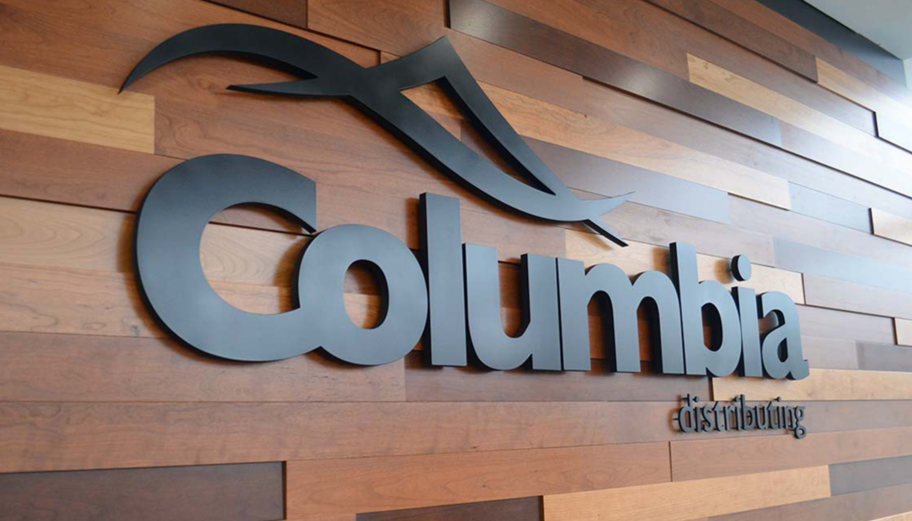
3D signage is introduced, featuring raised letters and effects that are even visible from a distance. The tactile nature will attract your guests’ attention to something that’s meant to stand out, whether it’s an overly bright or dark area.
Lack of Direction or Purpose
Non-distracting or decorative-only signage may be suitable in some photos, but an unclear sign can ultimately create a disorienting experience for the guest. Every sign should clearly state the answer to at least one of these questions: Who? What? Where?
When creating signage, clarity is the most crucial factor. Using communication like ‘Check in this way’ is the difference between managing your guests with ease and creating a bottleneck of confusion at the start of your event. Use plain language and design that supports, rather than detracts from, the general theme.
3D directional signage, designed in lenticular lettering, provides direction while also serving as a design element and work of art that generates engagement-worthy attention without requiring much, if any, text.
Overcrowded Design
Overloading the signage with too much information can quickly lead to a loss of guest interest. As hosts, they need to display hotel directories, detailed itineraries, welcome messages, hashtags, thank you notes, and venue rules, all in one signage unit. This leads to overcrowding.
Guests are not attending your event to read a wall of text. They will, however, briefly scan your signage for a few seconds and move on their way. As a result, reception signage should be direct, short, and clean.
If you want to include multiple messages, consider placing signage in several areas around the space. For the main reception area, the guideline is to have a central message that is concise and deliberate.
There are many ways to keep signage interesting, not just through minimal text and spacing. You can add minimal illustrations or textures to add interest. If you want to elevate your signage to the next level, consider using 3D signage to take care of the visual work for you. A raised welcome statement or a company’s logo will add visual impact without adding clutter.
Inconsistent Theme or Branding
Regardless of whether your event is a wedding or a gala, everyone wants everything, from the invitation to the seating of their guests, to deliver a consistent visual message. If just one or two signs at the reception break your planned visual identity, it creates a mess for your guests. The same goes for an event that would otherwise be stylish, but you decided to use signage from a party supply store.
Your fonts, colors, shapes, and materials should support your planned aesthetic. If your wedding is rustic, you may feature wood tones, textures, and a script font. If it is more contemporary, you likely used acrylic and a regular geometric style.
When incorporating textured matte paper (not to mention wooden forms!) with glossy plastic or serif headings alongside sans serif type, you will create a visual mess and appear sloppy when all styles are presented. Keep in mind that signage should be treated like decor for your evening and not thrown together at the last minute.
Poor Installation and Setup
Good reception signage may be prone to the faults of some installations. A sign that is crooked or unstable is not only a problem externally, but it can create unsafe situations. Any signage that is wobbly on a stool, in the way of a path, or blowing over outside won’t hold up as well as good signage.
Before the event begins, do not hesitate to complete a walkthrough of the venue with signage in mind. Plan for traffic patterns, lighting, and angles for photos, as well as whether the designs are outside, to paint a picture of where and when the sun may change during the event.
There is also the physical nature of the signage to consider. Lightweight signage might need weighted frames; heavier signage, such as 3D signage, may require a professionally installed/weighted base.
Suppose your signage is the focus of attention, such as a name board at a wedding or a branded welcome sign at a corporate function. In that case, you should execute a solid installation process to ensure stability and plumbness. Orientation matters, and if 3D signage is mounted improperly, you can never hope to photograph well; the shadows and depth are off.
Sample Setup Scenario
Signs are signs, directing, informing, and creating the first impression of your event. If well designed, reception signage provides the best of both worlds; it’s functional but also adds to the welcoming and organized atmosphere for your guests.
1. Poor Legibility
If guests cannot read your signage, then your signage is worthless. Small fonts, low contrast, and unusual fonts will all detract from the information you are trying to communicate with your signs. Quality signage will utilize bold fonts, good color contrast, and a proper size to allow guests to read the sign effortlessly, even at a glance, whether they are close, at a distance, or in low-lighting conditions.
2. Untidy Design
Poor or unfocused design can be a visual distraction at your event. Try not to go overboard with text on your signs or with dissimilar visuals. Large sections of white space are also a factor. Additionally, be aware of the need to orient the tea or coffee cups towards the people attending and consider a signage theme that is compatible in style, serving as a general allusion to the event as a whole. A clean and balanced design is more desirable, and at the very least, it conveys professionalism.
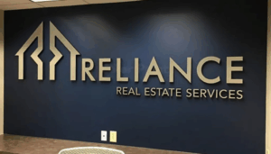
3. No Branding
If you’re thinking of generic signage, you’re wasting a lot. Instead, incorporate your logo, event colors, fonts, or even the slogan that resonates with the other, much larger items of visibility around your event that provide passive awareness. Suppose you give visual consistency with your brand identity or a safe visual anchor for the design nuances of your reception space, as well as visual reinforcement of your brand. In that case, you will build brand recognition for your event messaging. If you nail everything else, it will look professional.
Suppose you’re looking for lecture-style signage options that offer design elements, durability, and a professional finish. In that case, check with the signage professionals at Color Print to see if they provide custom size variations. Professionally printed signage can be fabulous, of good quality, with an engaging design, and featuring your brand. They can deliver signage for your reception area that conveys the right message, or the next step in your event marketing.
Wrap Up
Signage at your event is essential for event success. When signage is adequate, it is functional, providing directions, conveying your message, and making a lasting impression on your guests. Recognizing and avoiding the five most common signage mistakes—poor legibility, lack of clarity, sloppy design, insufficient branding, and improper mounting — will enhance your signage by a robust margin.
And when you feel you’ve reached a higher level of sophistication and visibility, consider incorporating 3D signage into your overall reception signage program. 3D signage is a great visual option that combines style and substance, potentially elevating your sign and event to a level of artistry, akin to a sculpture.
For professionally made signage and Receptions with style, design, and durability, it is possible to have professional printing, production, and custom products made at Color Print.